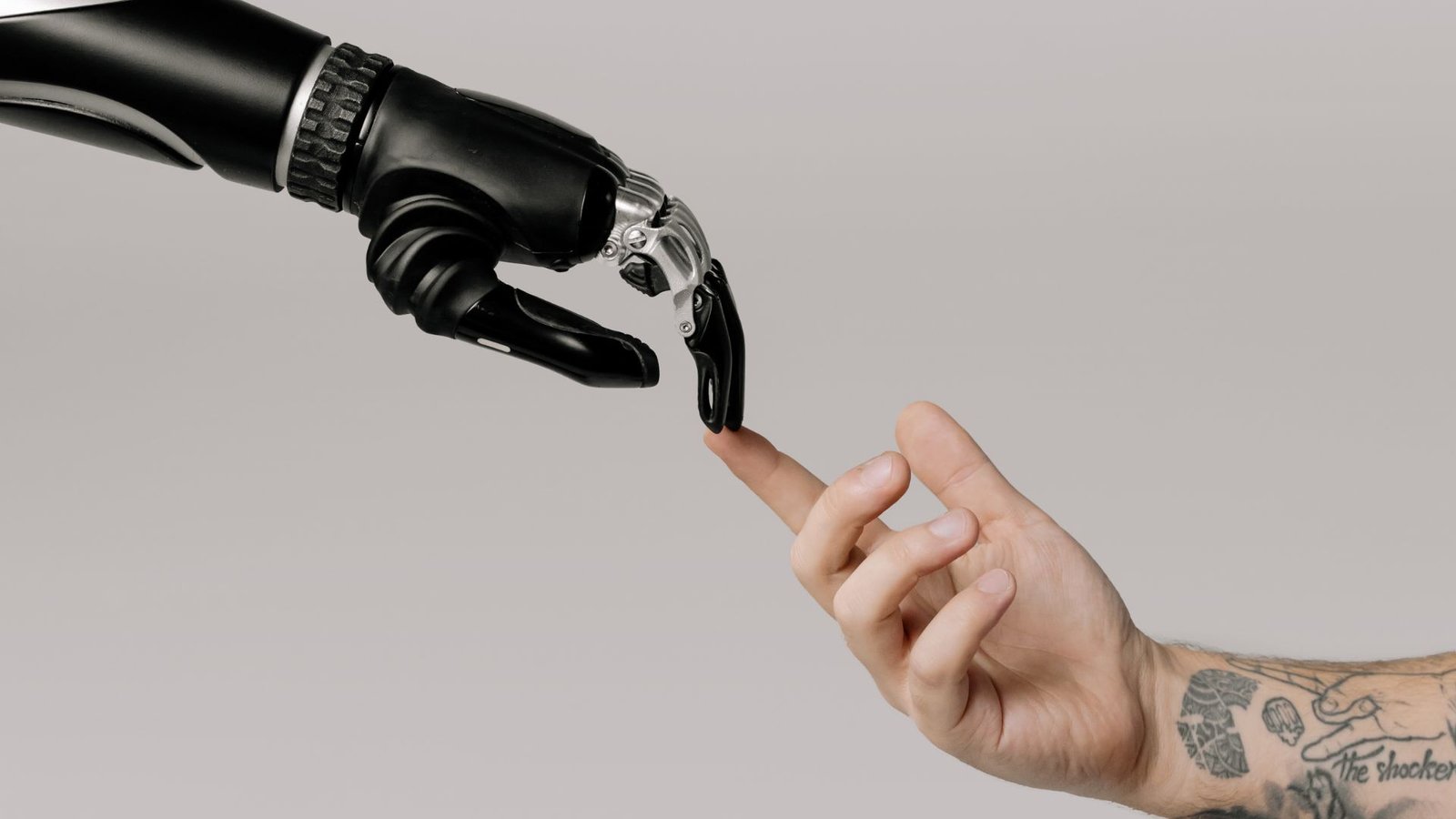
The New Rules of Typography in the AI Era
Come on, most of the design tips that are generated by AI sound like a robot attempting to mimic a creative director. You've read those articles: "In today's high-speed digital environment, typography is an essential factor in user interaction." Snooze. If typography is all about personality, then why does so much AI-written content about the topic sound so… lifeless?
Typography is no longer about selecting fonts. With AI technologies such as Mid journey vomiting up "perfect" font combinations in mere seconds and ChatGPT writing up entire brand guides, designers must rethink the way they work. The real challenge? Creating type that feels human in a world of machine-generated looks.
1. Break Free from AI-Guided "Safe" Options
AI adores predictable typography. Give it an input such as "modern tech brand font," and it'll regurgitate the suspects: Inter, Helvetica, perhaps a touch of Montserrat. It's not incorrect, it's just dull.
Human solution? Drill deeper.
Employ fonts with character. Experiment with Regular (a numbers first face) or Swear (a serif with attitude).
Jolt the grid every now and then. AI grids everything up humans don't. Experiment with asymmetrical spacing or designed misalignment.
Steal from unlikely places. Old packaging, street signs, or graffiti can be more inspiring than AI-crafted "trendy" fonts.
2. Imperfection Is the New Precision
AI-crafted typography is perfect which is precisely why it comes across as sterile. Hand-drawn font, variable fonts with subtle randomness, and even deliberate "mistakes" (such as misplaced glyphs) bring warmth.
Experiment this:
Pair with a tool like FontJoy, then hand-adjust.
Overlay text with subtle transparency or texture (grain, ink bleed).
Let messy custom lettering substitute for AI-perfect vectors.
3. Speed vs. Depth: The AI Typography Trap
AI will create 50 font ideas in 5 seconds. But great typography is not quantity it's context. A fintech startup and a punk zine shouldn't have the same sound, but AI tends to recommend identical "clean, modern" fonts.
Solution?
Ask "why" for each font selection. ("Why does this serif enhance our brand narrative?")
Test it in real life. Print it out, scribble on it, hold it in your hands off-screen.
Copy from history, not from AI. Take inspiration from 70s psychedelic posters or 1920s art deco type.
4. Dynamic Typography: More Than Static Text
AI approaches typography as a static thing. But in 2024, type is moving, responding, and engaging. Consider:
Animated hover states (not simply color changes morphing letterforms).
Generative type (fonts that respond to user input, such as Variable Hate).
3D type with depth (not merely extruded text consider shadows which respond to light).
Software such as Spline and Rive make it simpler than before.
5. The Return of Handmade Type
Ironically, the more advanced AI becomes at creating "perfect" fonts, the more valuable poor-quality human-made type becomes. Clients desire uniqueness—something the machines can't do (yet).
How to adopt it:
Utilize actual handwriting. Tools such as Calligrapher convert your scribbles into fonts.
Mix media. Blend digital type with scanned textures (pencil, ink, chalk).
Commission lettering artists. Their work has subtleties AI can't replicate.
Final Thought: Typography Should Feel Alive
AI will continue to become better at copying design principles. The true challenge? Creating type that breaks rules in ways only a human can.
So next time you’re tempted to ask ChatGPT for font suggestions, ask yourself: Would a robot make this choice? If the answer’s yes, it’s time to rethink.
Create and grow your online course business without the tech hassle.
SkillBloomer is the all-in-one platform built for educators, coaches, and trainers to easily design, launch, and scale their courses. No coding. No confusion. Just effortless growth.
.svg)
.svg)

 For Instructor

