.svg)
.svg)
 For Instructor
For those of you who have been to Mumbai, you know the local trains are the lifeline of the city. How many people use that system every day just to go from one place to another? How loud and crowded is the system? How amazing is it to see the way millions of people are connected through the system on a daily basis? Imagine if you could pull back and see how that sprawling, disjointed network was able to work in unison and "breathe" in real-time in a 3D environment. Could you?
I just recently stumbled upon a project that accomplishes exactly this idea. To say I was blown away would be an understatement. This ongoing project is a fully functioning simulation of the Mumbai local train system. Previous transportation planning projects and transit maps have given audiences insight into what the network looks like, but what makes this project so unique is the sheer amount of knowledge and effort that went into this project. It's truly remarkable.
Live Data Integration and the Magic of It:
While a map can depict a physical area of location, it only becomes full of life when you connect that map with live data. The simulation tool you will utilize is a great example of this. Rather than simply providing you with static lines that connect the various locations in the city, it will provide you with information about all the live data being mapped at that moment on-location.
Once the simulation tool is opened you will see the overall view of the entire city/location's network, but all the hidden treasures can be found by accessing the various analytic reports, which are all running in parallel to this simulation:
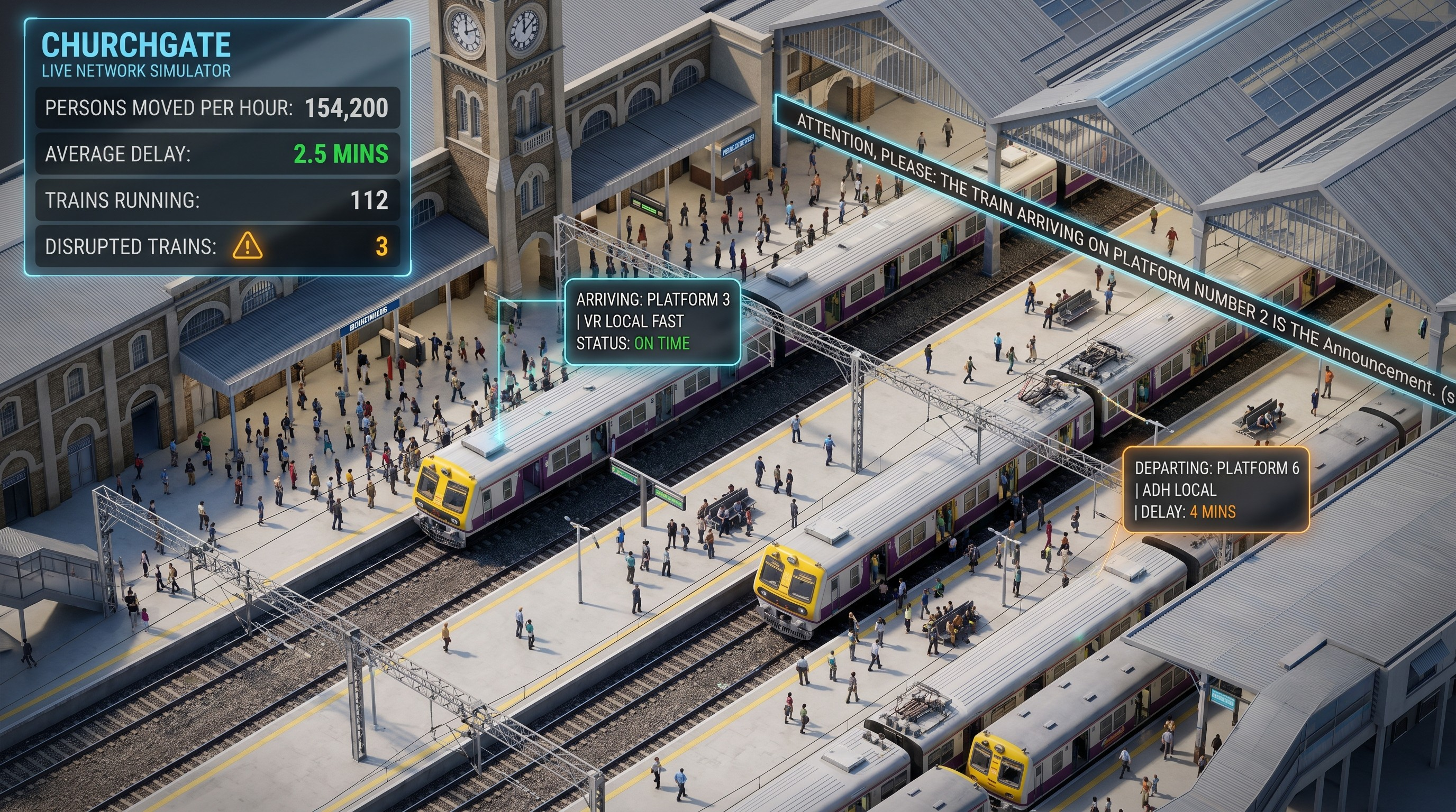
The number of people moved through the various transit systems in a given hour of the day: You can view the actual flow of the total population of the city in real-time; The simulation will provide visualisation showing the density of each segment of the metropolitan area as well as which transportation option is averaging the highest number of transported people.
The number of trains that are affected by disruptions: No public transportation system is devoid of flaws, the Mumbai Local transit system is guilty of generating disruption to goods and people from time to time. You can view the real time disruptions that are occurring, which will show you exactly where the congestion has developed.
The Average Delay: How many times do you have to run to the train station in the morning, and how much time can you get away with grabbing a cup of tea from the social café before your train leaves? The simulator calculates your average delay over the entire rail network.
Active Trains: A real-time counter showing the total number of trains that are currently in motion along the Western, Central and Harbour Lines combined.
Watching these values change as your digital train makes little movements across a beautifully drawn Map creates an incredible experience; it gives you a more peaceful feel about all the stress associated with commuting by providing an elegant dashboard with stats and figures based on your average time.
3D visualization of Churchgate
In addition to a fantastic macro view of the network, the simulator also offers very detailed micro views. Here’s an example: Churchgate station in 3D.
Churchgate Station has an extensive history as a major city terminus. Churchgate is massive with never-ending activity and atmosphere. When you click onto Churchgate from the simulator, the camera will drop onto the flat network map and present you with an incredible 3D view of the actual station with the platforms, track layout and entire building area.
You will be amazed at how much detail has been included in Churchgate. This isn’t just a basic shape – it truly resembles a tiny working model of the station, complete with spatial knowledge. It has transformed the use of transit data by allowing users to look at an actual physical space instead of a straight line in 2D. Visualizing in this manner allows users to visualize progressive cities like urban Mumbai, even before having been in the city.
"Attention!"
What an incredible way to make an impression! While viewing a 3D image of Churchgate Station along with information about the schedule for trains, something new occurs.
Someone turns on the announcement system!
The familiar chime goes off, and there is the famous voice: "Attention! The train on platform 2 is..."
The impact of this small addition creates a very strong effect. The combination of an actual train station announcement in concert with the digital representation of the real station connects the separation between raw data and living interaction. For those who have traveled through Mumbai, that same voice brings back all the memories (including how to catch a FAST train to Virar) associated with that place. This sound is synonymous with Mumbai. The addition of live localized audio to the visual simulation enhances the entire experience. The total effect is immersive, enjoyable and, simply put, incredible!
The "One-Shot" Wonder
The most surprising thing about this entire simulator is how effortless it seems. When I checked project for the first time, it looked like it was done in a single attempt — no long arduous process spanning several years to create this simulator. Instead, developers are able to take live data feeds and input them into powerful 3D rendering engines using today's tools and create a true work of art.
As we continue to live in a time where there are fewer and fewer barriers preventing developers from creating advanced, complex and visually-stunning graphical user interfaces using large amounts of data, developers can take advantage of high-quality mapping applications, current public transit data feeds and other powerful 3D web-based libraries to build city simulation applications faster than ever. The capabilities of this project to appear seemingly so seamless demonstrates the great advances that technology is making. This type of heavy lifting is not apparent to the end-user, it just looks amazing — a well-designed, polished and beautiful user interface.